I can't wait for autumn to begin 🤷♂️

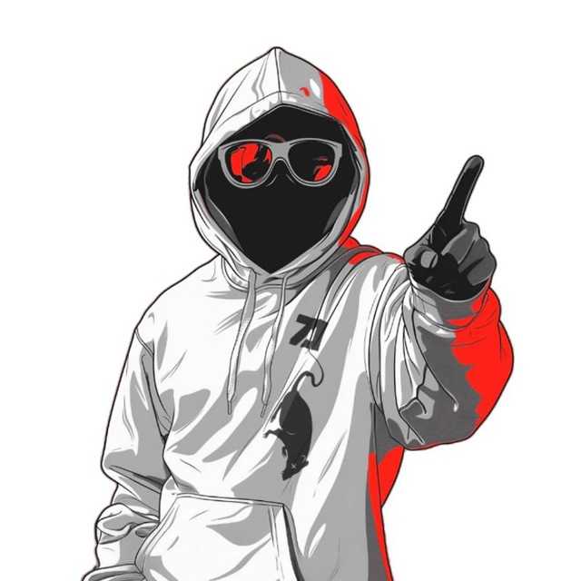
 Cel shading is such a cool effect. It's amazing how some people can make something look like a 2D cartoon style. I still have some practicing to do though.

 GM Frens
 This is fan art.
Not a logo. Not a brand. Not official anything.
It’s just a PayNym Pepe.
If you’ve used PayNyms before, you recognize it instantly.
If you haven’t, this probably looks like nothing.
That’s fine.
This is Bitcoin art without Bitcoin.
And free to download,
This is fan art.
Not a logo. Not a brand. Not official anything.
It’s just a PayNym Pepe.
If you’ve used PayNyms before, you recognize it instantly.
If you haven’t, this probably looks like nothing.
That’s fine.
This is Bitcoin art without Bitcoin.
And free to download, 
 On a battle with my little army 👍😂


 For me, it’s a nod to the “red pill” metaphor. That moment when you decide to look at things differently, to step outside the patterns you’re stuck in every day
Download Packacge includes
High-Quality Print File (300ppi, RGB) — suitable for professional printing as a poster, fine art print, or wall piece without loss of detail.
1 PNG File Original 59.4 cm x 84.1 cm / 7016px × 9922px
1 PNG File Full Transparant 59.4 cm x 84.1 cm / 7016px × 9922px
1 PNG File Transparant + Orange 59.4 cm x 84.1 cm / 7016px × 9922px
[Download & More Info](
For me, it’s a nod to the “red pill” metaphor. That moment when you decide to look at things differently, to step outside the patterns you’re stuck in every day
Download Packacge includes
High-Quality Print File (300ppi, RGB) — suitable for professional printing as a poster, fine art print, or wall piece without loss of detail.
1 PNG File Original 59.4 cm x 84.1 cm / 7016px × 9922px
1 PNG File Full Transparant 59.4 cm x 84.1 cm / 7016px × 9922px
1 PNG File Transparant + Orange 59.4 cm x 84.1 cm / 7016px × 9922px
[Download & More Info](


 One of the biggest improvements is the way navigation and discovery now work. **Explore** is clearly the place to discover substrs and communities, while **Discover** is the feed for the latest posts across different substrs.
The onboarding, settings, and signer flow have also become more approachable. New users now first see a simple choice between **Create account** and **Already have an account**, before entering the more technical signer flow. That makes the first impression less intimidating, while still preserving the flexibility of local signers and browser extensions like NIP-07.
We’ve also continued expanding the publishing side of Substr. Alongside regular posts, media posts, and discussions, Substr now supports long-form publishing through **NIP-23**. This opens the door for essays, announcements, deeper guides, and longer updates to live natively inside communities, instead of forcing everything into short feed posts.
A lot of smaller but meaningful improvements have also gone into how content is displayed. Media and rich-text posts now render more consistently, shared Nostr ID posts have been refined visually, mentions are handled better, and link/video previews behave more reliably. Opening a post from a feed into its /p/ page also feels smoother, with less unnecessary loading between the feed and the detail view.
**Other updates:**
* **Home opens with settings** now supports Explore, Discover, and My Feed.
* Clicking the logo now follows your selected home preference.
* Discover now uses smarter infinite loading instead of loading too much upfront.
* Explore can surface sections progressively, making the first load feel faster.
* The sidebar now shows a **More** button once you have joined more than 14 substrs.
* The bottom of the menu now includes a subtle clickable **Substr v1.0.0** link to /about.
* Substr Community cards on Explore now have an improved layout with more room for text.
* **Join** and **Joined** now have a clearer visual distinction.
* YouTube links now show an instant thumbnail preview in the composer.
* Posts and other signed actions now include \["client", "Substr"\] tags where it makes sense.
* Settings now show clear toasts again when saving.
* Reduced motion now actually affects the app.
* Multiple dark/light mode and theme preset issues have been fixed.
* Shared Nostr ID cards have a cleaner layout and more consistent preview behavior.
* Rich-text media now displays more consistently across cards and thread pages.
* Clearing notifications no longer allows old items to return later.
* All images in posts are now clickable for bigger view
That's it for this week.
On the the next one, cheers!
One of the biggest improvements is the way navigation and discovery now work. **Explore** is clearly the place to discover substrs and communities, while **Discover** is the feed for the latest posts across different substrs.
The onboarding, settings, and signer flow have also become more approachable. New users now first see a simple choice between **Create account** and **Already have an account**, before entering the more technical signer flow. That makes the first impression less intimidating, while still preserving the flexibility of local signers and browser extensions like NIP-07.
We’ve also continued expanding the publishing side of Substr. Alongside regular posts, media posts, and discussions, Substr now supports long-form publishing through **NIP-23**. This opens the door for essays, announcements, deeper guides, and longer updates to live natively inside communities, instead of forcing everything into short feed posts.
A lot of smaller but meaningful improvements have also gone into how content is displayed. Media and rich-text posts now render more consistently, shared Nostr ID posts have been refined visually, mentions are handled better, and link/video previews behave more reliably. Opening a post from a feed into its /p/ page also feels smoother, with less unnecessary loading between the feed and the detail view.
**Other updates:**
* **Home opens with settings** now supports Explore, Discover, and My Feed.
* Clicking the logo now follows your selected home preference.
* Discover now uses smarter infinite loading instead of loading too much upfront.
* Explore can surface sections progressively, making the first load feel faster.
* The sidebar now shows a **More** button once you have joined more than 14 substrs.
* The bottom of the menu now includes a subtle clickable **Substr v1.0.0** link to /about.
* Substr Community cards on Explore now have an improved layout with more room for text.
* **Join** and **Joined** now have a clearer visual distinction.
* YouTube links now show an instant thumbnail preview in the composer.
* Posts and other signed actions now include \["client", "Substr"\] tags where it makes sense.
* Settings now show clear toasts again when saving.
* Reduced motion now actually affects the app.
* Multiple dark/light mode and theme preset issues have been fixed.
* Shared Nostr ID cards have a cleaner layout and more consistent preview behavior.
* Rich-text media now displays more consistently across cards and thread pages.
* Clearing notifications no longer allows old items to return later.
* All images in posts are now clickable for bigger view
That's it for this week.
On the the next one, cheers!
 Might need to do something with this piece as it's collecting dust at the moment.