Comic Study Day 3. Tank Girl and "Camera" Placement.
I came across this page, and I noticed something off. Haha.
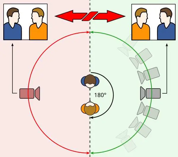
 Let me explain. I don't know if this is taught or focused on in comics, but in Film/Animation we are taught the 180 degree rule. Which is where the camera should not cross the 180 degree line of the stage. "The rule states that the camera should be kept on one side of an imaginary axis between two characters, so that the first character is always frame right of the second character. Moving the camera over the axis is called jumping the line or crossing the line; breaking the 180-degree rule by shooting on all sides is known as shooting in the round."
This helps keep things visually clear. Of course it is broken intentionally on occasion to convey to the viewer something is wrong, a jarring and confusing moment. It is usually intentionally done.
Let me explain. I don't know if this is taught or focused on in comics, but in Film/Animation we are taught the 180 degree rule. Which is where the camera should not cross the 180 degree line of the stage. "The rule states that the camera should be kept on one side of an imaginary axis between two characters, so that the first character is always frame right of the second character. Moving the camera over the axis is called jumping the line or crossing the line; breaking the 180-degree rule by shooting on all sides is known as shooting in the round."
This helps keep things visually clear. Of course it is broken intentionally on occasion to convey to the viewer something is wrong, a jarring and confusing moment. It is usually intentionally done.
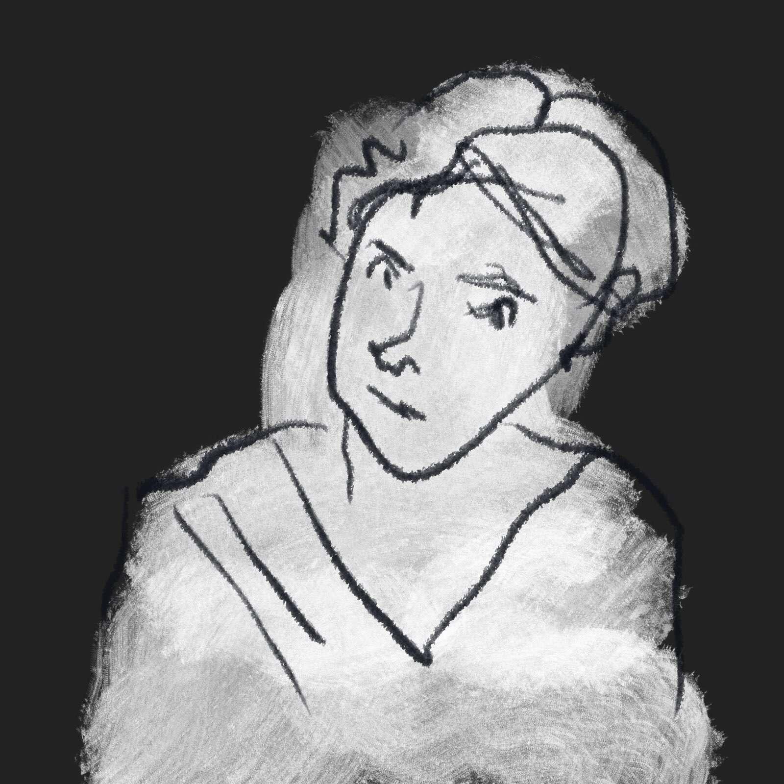
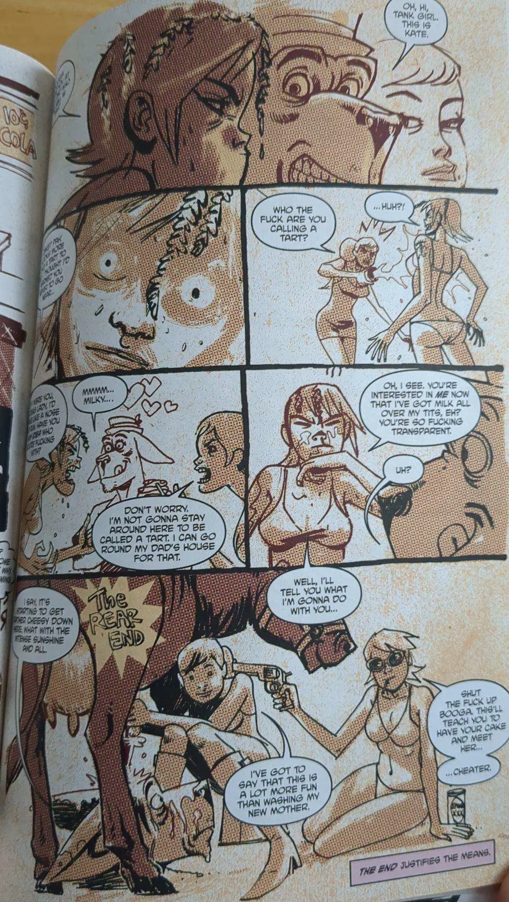
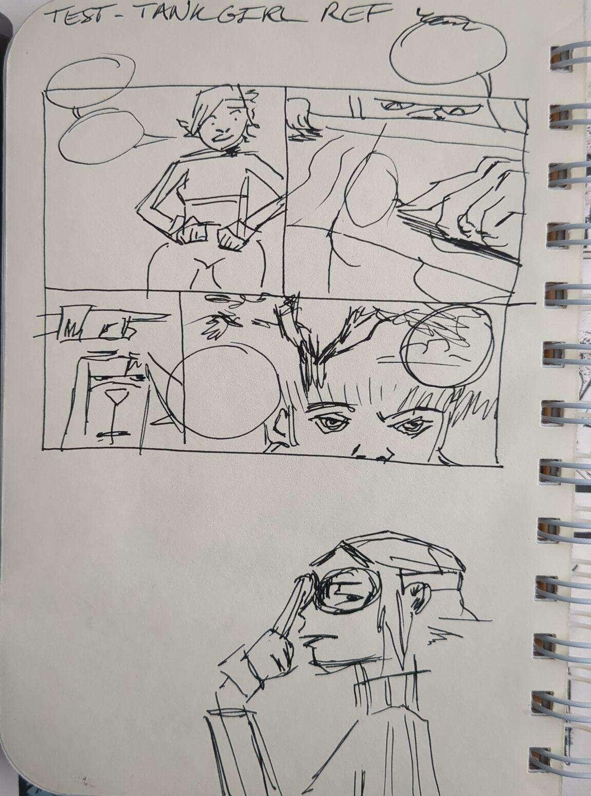
 Tank Girl breaks that in panel 3 where ponytail girl flings milk at Tank Girl. Which is confusing because Tank Girl is established on screen Left, the Kangaroo is in the Middle, and ponytail is screen Right.
I redrew it with the "proper" placement.
Tank Girl breaks that in panel 3 where ponytail girl flings milk at Tank Girl. Which is confusing because Tank Girl is established on screen Left, the Kangaroo is in the Middle, and ponytail is screen Right.
I redrew it with the "proper" placement.
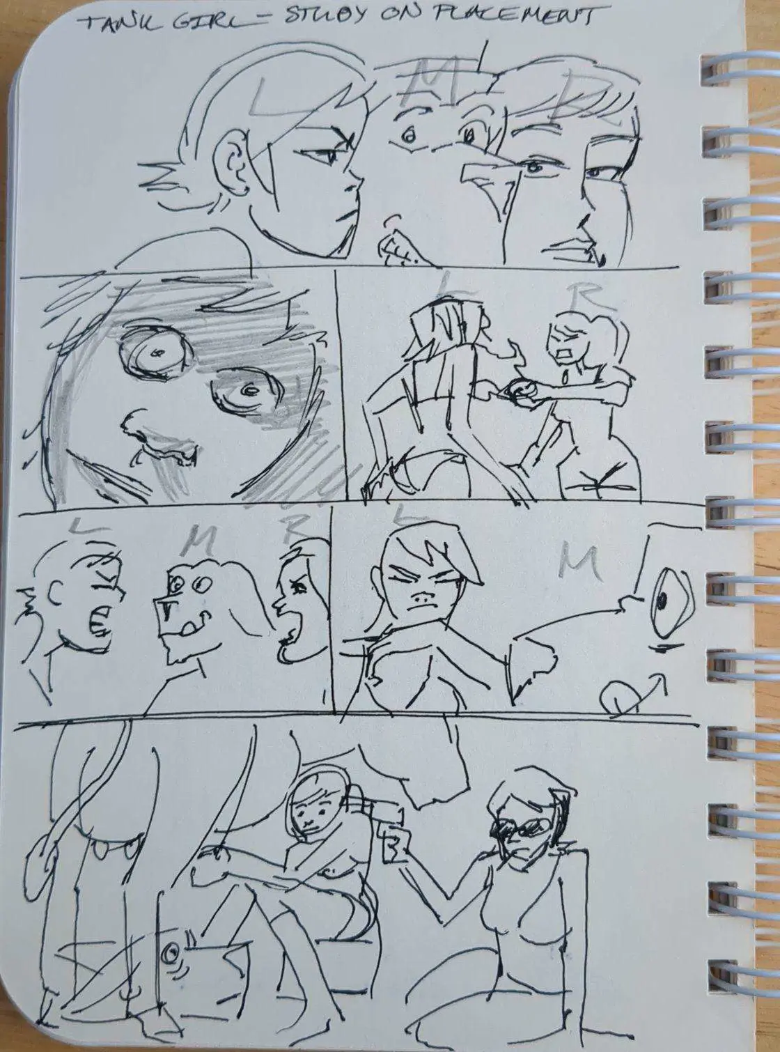 As I drew I realized why Ashley Wood did it that way, it was because of the flow of the dialogue/speech bubbles. I imagine he did it that way so your eye would flow smoothly from one panel to the next. So that is interesting how the flow of speech can sometimes disrupt the flow of the images.
The last panel with the cow is fine because he is establishing this is a new location, so the rules/camera placement can be different, I think the placement change also helps establish that time passed and they are somewhere different because there is literally no background.
An article explaining more about the 180 degree rule with examples if you are curious:
As I drew I realized why Ashley Wood did it that way, it was because of the flow of the dialogue/speech bubbles. I imagine he did it that way so your eye would flow smoothly from one panel to the next. So that is interesting how the flow of speech can sometimes disrupt the flow of the images.
The last panel with the cow is fine because he is establishing this is a new location, so the rules/camera placement can be different, I think the placement change also helps establish that time passed and they are somewhere different because there is literally no background.
An article explaining more about the 180 degree rule with examples if you are curious: 
Let me explain. I don't know if this is taught or focused on in comics, but in Film/Animation we are taught the 180 degree rule. Which is where the camera should not cross the 180 degree line of the stage. "The rule states that the camera should be kept on one side of an imaginary axis between two characters, so that the first character is always frame right of the second character. Moving the camera over the axis is called jumping the line or crossing the line; breaking the 180-degree rule by shooting on all sides is known as shooting in the round."
This helps keep things visually clear. Of course it is broken intentionally on occasion to convey to the viewer something is wrong, a jarring and confusing moment. It is usually intentionally done.
Tank Girl breaks that in panel 3 where ponytail girl flings milk at Tank Girl. Which is confusing because Tank Girl is established on screen Left, the Kangaroo is in the Middle, and ponytail is screen Right.
I redrew it with the "proper" placement.
As I drew I realized why Ashley Wood did it that way, it was because of the flow of the dialogue/speech bubbles. I imagine he did it that way so your eye would flow smoothly from one panel to the next. So that is interesting how the flow of speech can sometimes disrupt the flow of the images.
The last panel with the cow is fine because he is establishing this is a new location, so the rules/camera placement can be different, I think the placement change also helps establish that time passed and they are somewhere different because there is literally no background.
An article explaining more about the 180 degree rule with examples if you are curious: StudioBinder
Crossing The 180 Degree Line With Purpose
What is the 180 degree rule and why does it matter? We’ll cover the do’s and don'ts of “crossing the line” and how other films break t...
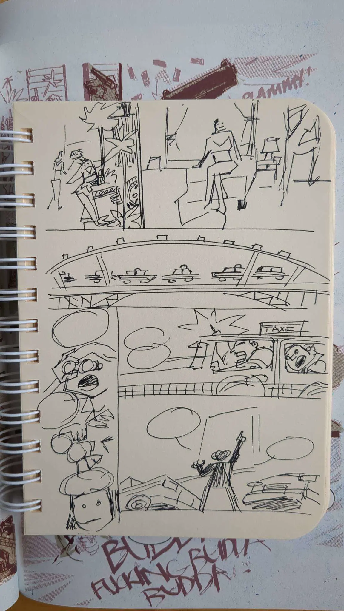
 I like the flow of the panels and how visually straightforward yet interesting everything is. It really leads the eye.
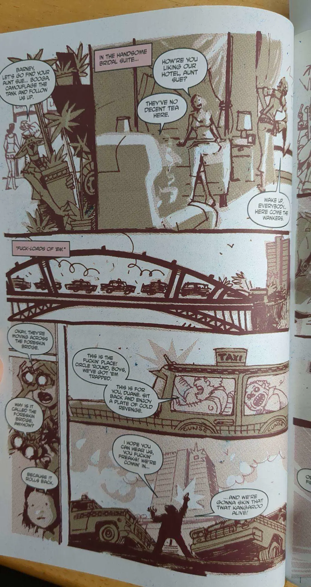
The original page:
I like the flow of the panels and how visually straightforward yet interesting everything is. It really leads the eye.
The original page:
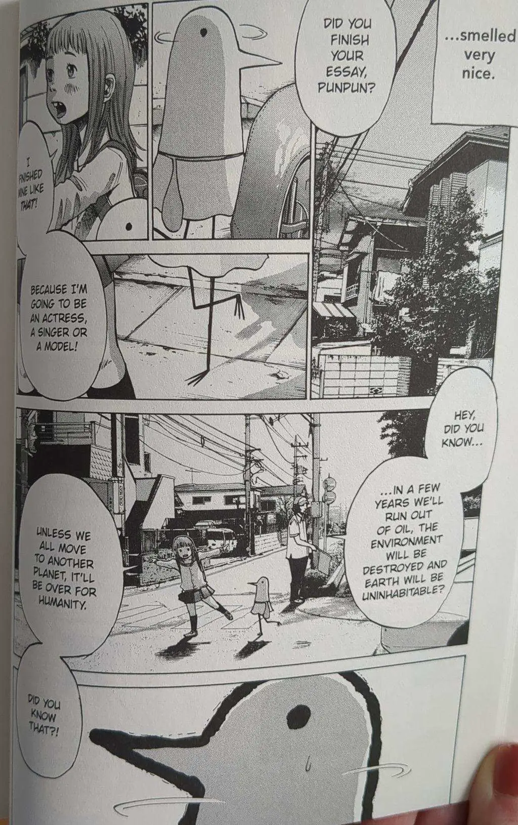 Where as Tank Girl has 13+ sentences each page. That's not showing that is telling. In visual media that's usually a bad sign. Now if this were a novel it would be a different story entirely.
This was a good comparison to me, I will keep my eye out for things that are too wordy. It means I'm not conveying an idea well.
#study #tankgirl #manga #artstr #comicstr
Where as Tank Girl has 13+ sentences each page. That's not showing that is telling. In visual media that's usually a bad sign. Now if this were a novel it would be a different story entirely.
This was a good comparison to me, I will keep my eye out for things that are too wordy. It means I'm not conveying an idea well.
#study #tankgirl #manga #artstr #comicstr