A Data Love Letter to the Subway

Pentagram
‘A Data Love Letter to the Subway’
A data-driven animation for Fulton Center commissioned by MTA Arts & Design for its 40th anniversary.
A data-driven animation for Fulton Center commissioned by MTA Arts & Design for its 40th anniversary.

# The animated installation visualizes each train line as a character whose unique qualities are extracted from MTA data.
Commissioned by MTA Arts & Design for its 40th anniversary, Pentagram partner Giorgia Lupi has designed a data-driven animation for Fulton Center, with the synchronized artwork spanning all 52 screens across the FIDI transit hub. The animated installation, A Data Love Letter to the Subway, visualizes each train line as a character whose unique qualities are extracted from MTA data. Imaginatively unpacking and animating each line’s age, length, and path, Lupi writes a poetic story that explores the trains’ interwoven encounters with commuters and one another. By turning the overfamiliar into a dreamy narrative, Lupi’s Love Letter reveals the connections that hum in the background of our shared urban life.
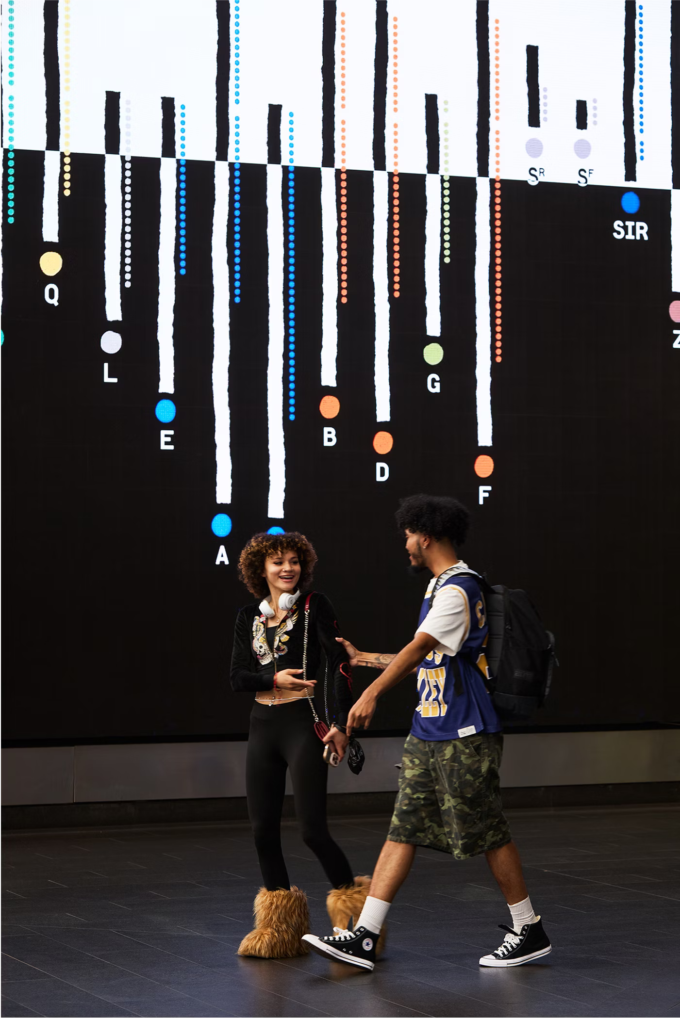
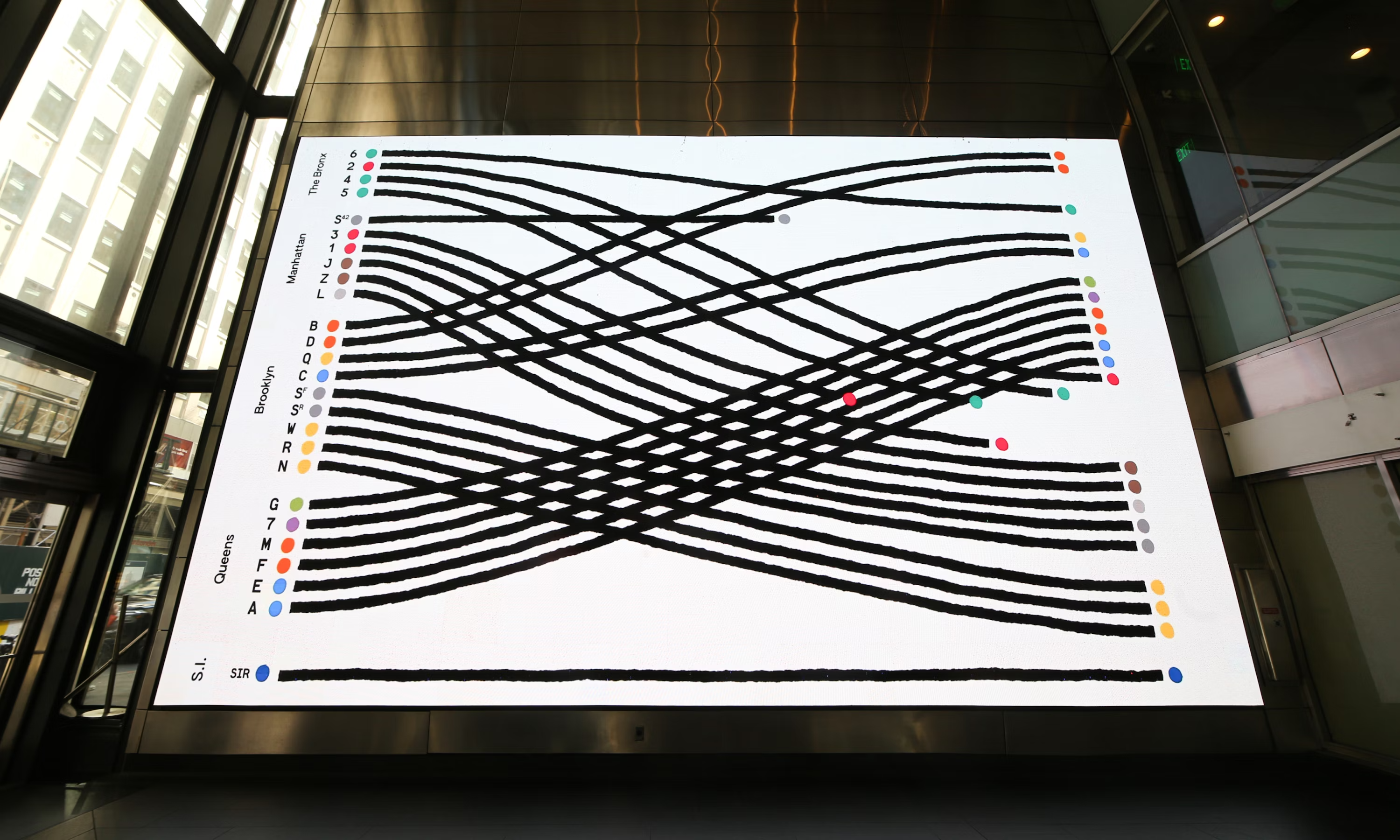
This commission was a chance to envision the subway system beyond a static informational map. Drawn to the beauty of the trains’ intersections, movements, and idiosyncrasies, Lupi and her team sought to unveil the visual poetry of this infrastructure: abstracting the trains’ data provides a rich view of their interactions, roles, differences, connections, and missed opportunities. Riding the subway is a collective experience, and a plurality of stories emerge when we rub shoulders with other commuting New Yorkers. Within these stories, the trains play an integral role — their doors close as we lock eyes with someone on the platform, or a skipped stop leads us to a conversation with a stranger. Lupi’s Love Letter prompts us to think about the subway as the backdrop and architect of these interactions. Transforming what is often a source of frustration and complaint for commuters, Lupi and her team reveal the poetry in the subway’s collective network of stories.
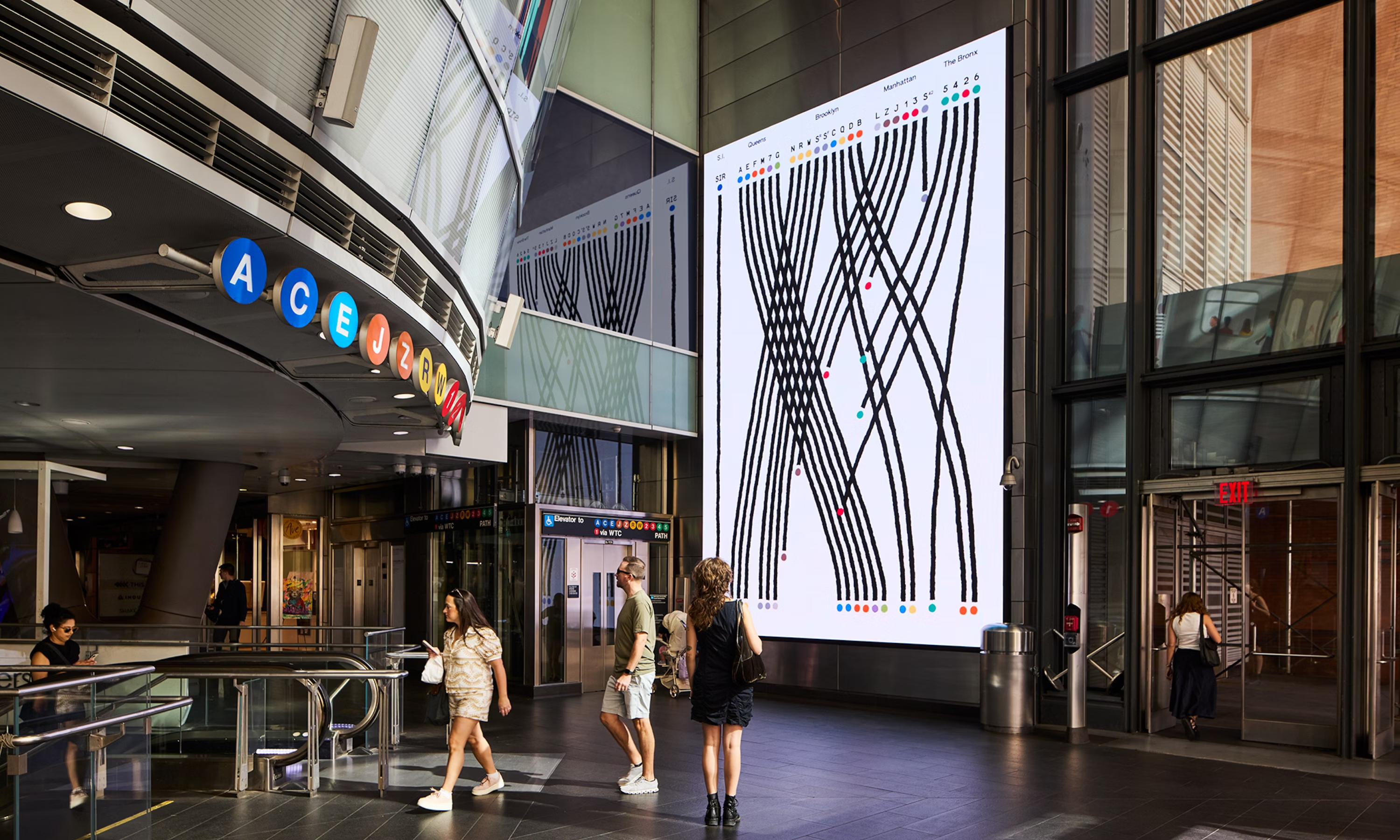
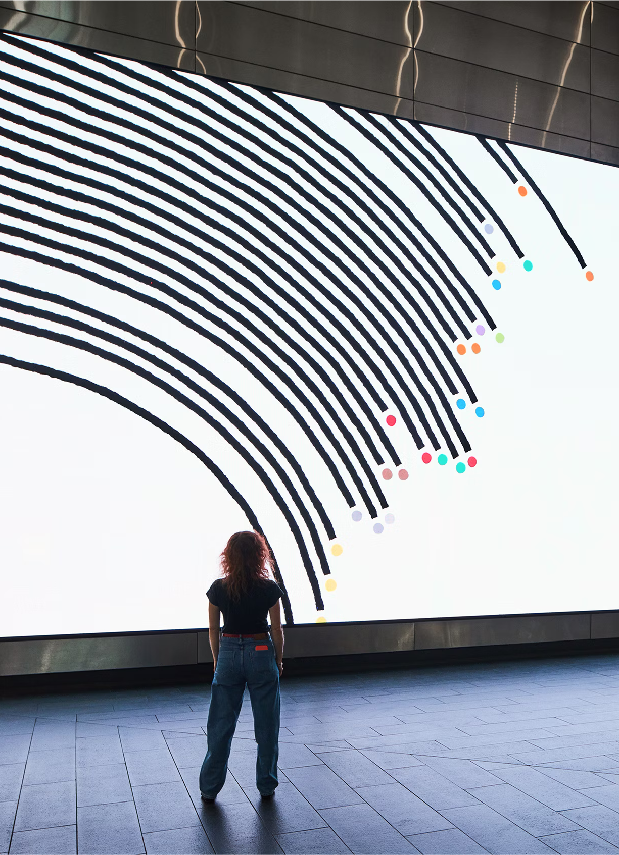
Lupi and her team began the project by poring over subway records like MTA Open Data and missed connections boards. They extracted and arranged the data, asking how these numbers could be seen from different perspectives – but mainly they wrote a story, transforming their findings from the data repository into a narrative and script. The animation is intentionally black and white, with painterly features — both a nod to the whimsical and elemental nature of picture books and a site-specific effort to counter the visual noise at Fulton Center. The train’s lines are rendered with a hand-drawn quality, integrating the feeling of the initial sketches and maps.
As we interact with each other and the world around us, we create data that often lingers in our subconscious. A Data Love Letter to the Subway reveals the subway ecosystem through the lens of this data, describing the hidden patterns in our everyday lives. Following the characteristics of different lines through the subway system, Lupi’s Love Letter celebrates the MTA’s data as a representation of the real world, and reminds us that data is an abstraction that can bring new perspectives to familiar structures and patterns. This data snapshot captures all New Yorkers — the trains are characters in our stories that take us places every day, relating us to the city and one another.
A Data Love Letter to the Subway is on view at Fulton Center, New York, NY. The two minute animation will play at the top of every hour through January 5, 2026.


Stacker News
A Data Love Letter to the Subway \ stacker news
A data-driven animation for Fulton Center commissioned by MTA Arts & Design for its 40th anniversary. The animated installation visualizes each tra...

 # What #creative #ideas have you been rambling on?
This post is part of a series. It is meant to be a place for anyone to discuss a #WIP #projects, or an #idea worth to #build. Regardless of your #project being personal, professional, physical, digital, or even simply an #idea to brainstorm together.
If you have any creative projects or ideas that you have been working on or want to eventually work on... This is a place for discussing those, gather initial feedback and feel more energetic on bringing it to the next level.
₿e #Creative, have #Fun, share it at
# What #creative #ideas have you been rambling on?
This post is part of a series. It is meant to be a place for anyone to discuss a #WIP #projects, or an #idea worth to #build. Regardless of your #project being personal, professional, physical, digital, or even simply an #idea to brainstorm together.
If you have any creative projects or ideas that you have been working on or want to eventually work on... This is a place for discussing those, gather initial feedback and feel more energetic on bringing it to the next level.
₿e #Creative, have #Fun, share it at