:D's avatar
:D
deSign_r@stacker.news
npub12lg6...ac9c
it's like r/ #Design but we pay you #Bitcoin for your #posts ⚡️𝙻𝚒𝚐𝚑𝚝𝚗𝚒𝚗𝚐? 𝑆𝑢𝑟𝑒! deSign_r@coinos.io 🔮 𝚗𝚘𝚜𝚝𝚛? 𝑌𝑒𝑠!... deSign_r@stacker.news
:D's avatar
deSign_r 6 months ago
Conspiratorial Design. Information design for the bigger picture ![](https://m.stacker.news/119442) ![](https://m.stacker.news/119443) Bringing two concepts we usually regard as antithetical, visual designer Carlo Bramanti examines how design and conspiracy theory intersect in their practices and output. Design is generally perceived as a discipline that makes the complex intelligible; it illustrates reliable facts and streamlines information. Conspiracy theories, on the other hand, stretch facts to their most grotesque limits; they create chaos and confusion. And yet, for Bramanti, both attempt to address the same human aspiration for meaning and order. Design (in particular information design) and conspiracy theory, he says, share a tendency to think in terms of large-scale systems. They both look for strong and seductive narratives that will reveal “the bigger picture”. Designers process vast amounts of information and synthesise them in an engaging way. To do so, they look for patterns and new connections, which makes them vulnerable to conspiracy. But while design strives to “raise awareness”, conspiracy theory talks about “awakening”. Bramanti finds the connections between design and conspiracy theory so compelling that he coined a term for the common ground that they share: Conspiratorial Design. ![](https://m.stacker.news/119444) ![](https://m.stacker.news/119445) https://stacker.news/items/1293592
:D's avatar
deSign_r 6 months ago
In the sea of sameness ![](https://m.stacker.news/119439) 
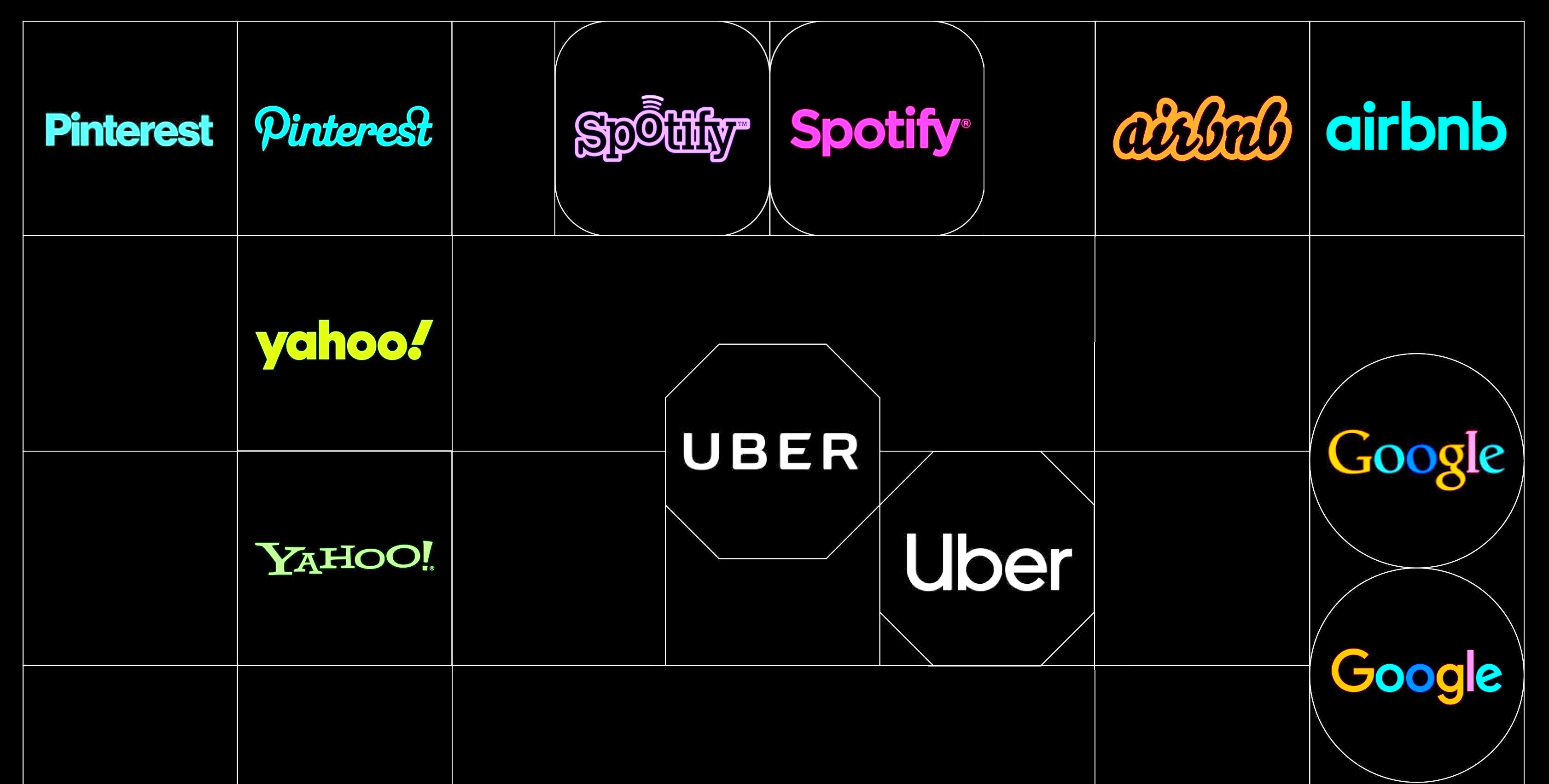
Finding a soul in this world seems to be a rare quality these days, especially in software-internet-land. - Every app looks the same. - Every website looks the same. - Every process looks the same. The rise of Tailwind, design system templates, and other dev frameworks has made it easier than ever to achieve visually appealing designs, often without the need for a designer’s hands. Out-of-the-box components, elegant icons, and ready-to-apply CSS are now within reach for whoever desires. 
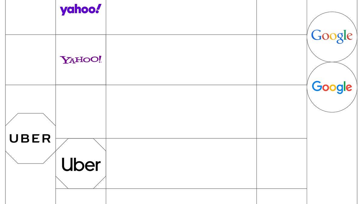
This abundance has made programming life easier while speeding up the design process, but it also appears to dull creative thinking. Alongside trends that come and go, sameness has become the default state. The spark of the past has faded in many aspects, far beyond the digital sphere: quirky tech brand logos have turned banal, social networks media wear the same interface, and web design is.. well, web design. https://stacker.news/items/1293588
:D's avatar
deSign_r 6 months ago
The 9x Problem Nobody in AI Talks About ![](https://m.stacker.news/119296) In 2006, John Gournville published a paper in Harvard Business Review called “Eager Sellers and Stony Buyers” that should be required reading for every AI founder. His core finding: to get users to switch products, your new thing has to be *nine times better* than what they already use. Not twice as good. Not “demonstrably superior.” Nine times. Here’s why. Users overvalue what they already have by a factor of three—the familiarity, the muscle memory, the sense of control. And companies overvalue what they’re offering by a factor of three—because they built it, they know every feature, they see the potential. Three times three equals nine. This creates what Gournville called a “mismatch of nine to one, or 9x, between what innovators think consumers desire and what consumers really want.” AI companies act like their next model release will make users switch. They announce benchmark improvements like they’re declaring victory. “Our model is 12% better at coding tasks!” Cool. Is it nine times better? No? Then I’m staying where I am. https://stacker.news/items/1292172
:D's avatar
deSign_r 6 months ago
Locksmith stickers are annoying, but kind of genius https://uxdesign.cc/locksmith-stickers-are-annoying-but-kind-of-genius-85690b7ae045 ![](https://m.stacker.news/119294) Locksmith stickers are annoying, illegal, and typographically messy. But by appearing where you least expect them — from letterboxes to lift ceilings — they are a masterclass in low-tech, persistent, and surprisingly effective guerrilla marketing. Archived at https://archive.is/cqmLI https://stacker.news/items/1292169
:D's avatar
deSign_r 6 months ago
FranSans by Emily Sneddon ![](https://m.stacker.news/119286) ![](https://m.stacker.news/119292) Fran Sans is a display font in every sense of the term. It’s an interpretation of the destination displays found on some of the light rail vehicles that service the city of San Francisco. This balance of utility and charm seems to show up everywhere in San Francisco and its history. The Golden Gate’s “International Orange” started as nothing more than a rust-proof primer, yet is now the city’s defining colour. The Painted Ladies became multicoloured icons after the 1960s Colourist movement covered decades of grey paint. Even the steepness of the streets was once an oversight in city planning but has since been romanticised in films and on postcards. So perhaps it is unsurprising that I would find this same utility and charm in a place as small and functional as a train sign. ![](https://m.stacker.news/119285) ![](https://m.stacker.news/119290) ![](https://m.stacker.news/119293) ![](https://m.stacker.news/119287) https://stacker.news/items/1292166
:D's avatar
deSign_r 6 months ago
The Rosetta Stone of Design Engineering ![](https://m.stacker.news/119283) A deeper look at how design and engineering meet, overlap, and translate meaning — and why a shared language of making is the only way to build real shipping velocity. Before we dive in, you can watch the original talk during Granola's Design Engineering Night #4 that inspired this piece. It’s up on YouTube if you want the live version. ## The problem with two rails and one destination I’ve always imagined design and engineering as two rails on the same track. They run in parallel, supposedly toward the same product, but they rarely sit at the same spot. Design debt on one side, tech debt on the other, shifting priorities somewhere ahead, and the occasional giant “wait what are we building again?” boulder in the middle. https://stacker.news/items/1292158