 Paris, 2007
daniele
_@dtonon.com
npub10000...vwqk
Working on https://fevela.me, https://nstart.me, https://njump.me, https://oracolo.me and other inspiring nostr projects. I love to build helpful things that people are pleased to use, mixing tech, design, usability and accessibility.
 Paris, 2007
Today I spent some time reviewing typography in @YakiHonne, since I believe that this nice app with some little touches can become really gorgeous.
Typography can seem a secondary element but it's really important. Consistent use of font sizes and line-heights throughout the app, including the UI, immediately enhances the quality of the design and significantly improves usability / readability.
There is a problem that applies to virtually all clients: optimization of paragraph spaces. I'm sharing this here for general usefulness.
Since Nostr notes are plain text, the only way to highlight paragraphs is to use a double carriage return. This is perfectly fine from a compose point of view, but creates a suboptimal display when notes are rendered.
Paragraphs usually are equal to one line-height in traditional print, and slightly larger (~ x1.25) in web design and digital UIs; instead of applying a double carriage return, you have a blank line and 2 line-heights (top and bottom), that sum up to ~ x4 the font size (or x.2.6 the line-height)!
Often these paragraph spaces are larger than other spaces used to separate areas in the note block, or even to separate notes in the feed, so this totally ruins the design and the readability of the content.
A similar problem arises when such spaces are used around media, note/article mentions, links preview, etc; the gap is too high.
This is an example of the described problem in @YakiHonne and @Jumble
Spaces between paragraph are excessive and similar to the gap between notes, making it difficult to scan correctly at a glance:

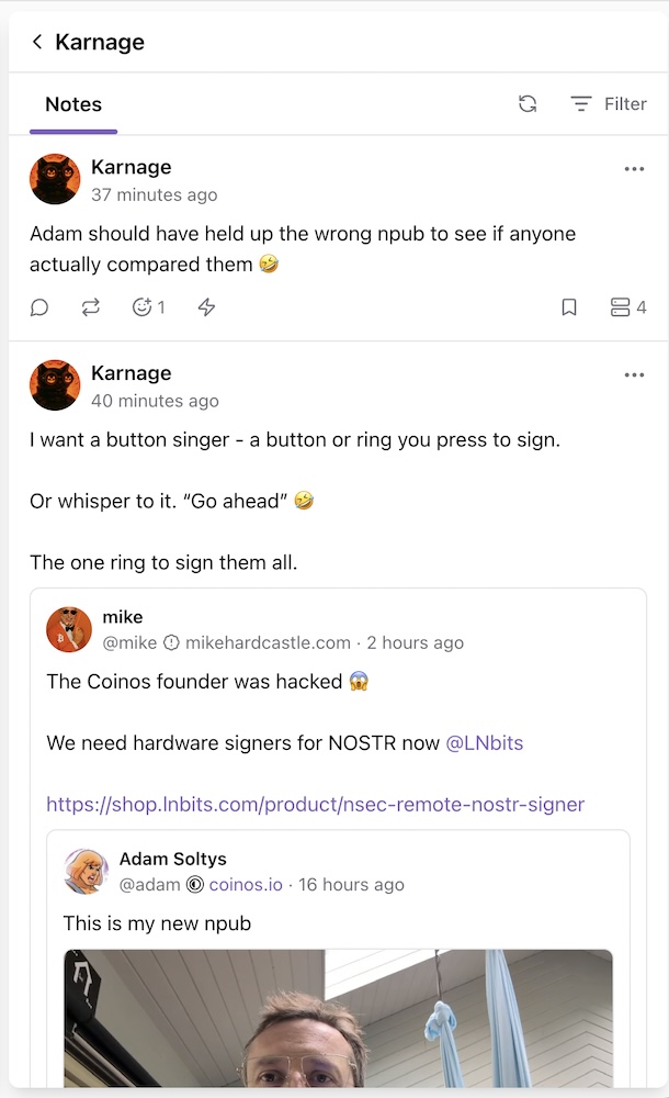 The proposed solution is to parse blank lines and replace them with a space 30% larger than the line-height (so about x2.0 for the Latin character set and x2.4 for the Japanese one).
Before and above non text blocks (media, etc) another 10-15% additional space can be added.
#nostrdesign


@YakiHonne why the app's repository has been archived?
 Where can I find the last source/release, an d open issues?
GitHub
GitHub - YakiHonne/yakihonne-mobile-app: YakiHonne mobile app for Nostr and Bitcoin
YakiHonne mobile app for Nostr and Bitcoin. Contribute to YakiHonne/yakihonne-mobile-app development by creating an account on GitHub.
@YakiHonne your Android app fails to load my relays setting, and so it blocks any post :(
Damn, I finally solved the constant "something went wrong/video unavailable" youtube blocks:
yt-dlp -o - "https://www.youtube.com/watch?v=xxxxxx" | mpv -
Bonus: zero distraction interface & zero ads.
In the last release of "grouped notes" (https://grouped-notes.dtonon.com) I added the option to include replies. Currently there is a single feed, would you prefer to have two feeds (Notes/Replies) with a top tab switch, like in the classic view? If so, why?
In the same way but inversely the profile view has Notes/Replies tabs, would you you prefer to view all notes in a single feed? Since in this view we focus a single profile and the quantity of content is limited, the latter option seems actually a little more usable.
Cooking something new for @hodlbod

Glide, an extensible, keyboard-focused web browser with a TypeScript config that lets you build anything.
View quoted note →
Yes.
I think the solution is quite simple: you are your own moderator, and you need to carefully decide which sources deserve your attention and energy.
If someone is unable to consciously support this, for example a child, access to information must be mediated, by humans, not technology.
View quoted note →
Art is life, often.
Sometime life is art.
Art supports life, always.

