WCAG 2.1 color contrast guidelines are a bit of a disservice to design. Color and contrast perception is much more complex than two simple ratios for small and large text.
Modern operating systems have tons of features that allow users to adjust text size, contrast, etc. Perception changes based on ambient lighting and smartphones adjust the display to those conditions. There are also different font weights, and fonts with different characteristics (like the fine lines of Bodoni), as well as effects like outlines and drop-shadows. As well as different use cases - reading dense scientific material strains eyes more than a quick scan of some news headlines.
WCAG 2.1 is like a blunt instrument. It can be a good starting point, but it's not the end-all-be-all (APCA is a good step forward). A more sophisticated approach also takes these other factors into consideration. Unlike designing for print, screen interfaces can be super dynamic and responsive and adjust to whatever the user needs and wants.
Christoph Ono
gbks@nosta.me
npub1kuc7...0eyw
Designer & developer. Helping improve bitcoin design with many others at https://bitcoin.design . I write a weekly update at https://gbks.substack.com . ✌️
If there was an award for least intuitive design tool, Adobe InDesign would be my clear favorite. Even after decades of occasional use, selecting things, changing a color, resizing an image, and other super basic stuff remains absolutely unintuitive and I have to keep asking AI for how those things work. Always makes me super appreciative of the latest generation of design tools.
Many social media replies are not actual replies to what was being said. People often use posts as springboards for whatever they want to say rather than actually engaging with what was written. Best to just ignore those?
Flashback to 2019 Casa SatsTags.

Well, I am excited to use my bitcoin wallet in the quantum realm.

Just tossing out some ideas as a first reaction to some of the stuff I learned from the Presidio Bitcoin Quantum Summit. Sounds like we might potentially need a lot of changes? All TBD, of course, as more research and consensus is needed, but interesting to start feeling this out nonetheless. Where are you on this topic?

Beware of the €5 wrench (although it probably costs a lot more that that size).

Not an expert, but this sounds like the next euphoria, collapse and downturn are preprogrammed due to greed and obnoxious financial games. Can we maybe please not? Or am I not understanding this correctly? 
Apple Podcasts
Are Bitcoin Treasury Companies Built to Last? with Marty Kendall | SLP674
Podcast Episode · Stephan Livera Podcast · 14/07/2025 · 1h 9m
Weekend. Good weather. Time to go outside. Have a good one.
Can you ever have enough Liquid Glass? I think not.

My Midjourney sessions often require a ton of iterations (image is one session). There's a fun back-and-forth between tweaking prompts, making manual edits, and seeing what the randomness of the models produces. You can evaluate an image in a split-second, which is not the same with code or text. But it should be doable to an extent with generated UI, but the tools for that don't seem to embrace this type of quick iteration with multiple suggestions from what I've seen. Might be helpful.

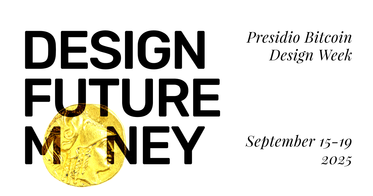
The website for the Presidio design week event was fun to design. I like the title "Design future money", it provides a great entry point into digging deep into this topic. The illustrations tap into the coin, bank note, and payment card as these recognizable physical manifestations of money, and it's interesting how we have bitcoin versions of these with the term bitcoin itself, printable ecash notes, NFC cards, etc. Lots of ideas and concepts to play with as we figure out how money can work better.

Presidio Bitcoin Design Week
Presidio Bitcoin Design Week
We’re bringing together designers from the bitcoin community and designers from across Silicon Valley’s tech community to tackle how to beautif...

Did a quick test to see what the Bitcoin Core App might look like in the Liquid Glass style. After trying it out in the beta, I don't think the changes are super massive. The biggest thing is probably that there are much fewer fixed bars at the top and the bottom. Those buttons are moved in a little bit as floating elements. And then you have the progressive blur behind them to create the needed contrast. Those buttons are also more dynamic and re-arrange as you scroll, or morph when enabling modes (like going to select/edit in a list). It's like there are two layers now - the content layer and the glassy button/function layer on top of it. Still learning though.
I imagine that adjusting to these is much easier with native iOS, and apps using web technologies to render have a super hard time to imitate those behaviors.
What do you make of Liquid Glass? Did you have a chance to mess with it yet?

Was great to present and demo the Bitcoin Core App wallet alpha in Prague last week. So happy our signet transfer during @Michael presentation worked. Feedback was positive. Huge thanks to everyone chipping in on the project. 
@Michael on stage.

People talking about magic.

These are fun for work background music.
The best collaborations are when everyone can be part of the whole process, has a say, and chips in to the parts they are really good at.
I'm excited for the dev/hack/day at BTC Prague next week. I'll present findings from the interviews with activists we did at the Oslo Freedom Forum. They have serious problems bitcoin can help with, but the majority is not using it. 
BTC Prague
dev/hack/day - BTC Prague