Designer & developer. Helping improve bitcoin design with many others at https://bitcoin.design . I write a weekly update at https://gbks.substack.com . ✌️
Pretty amazing what you can do in a day with €0.5 worth of Claude Sonnet 4 credits via Github Copilot in Visual Studio Code.
Man do I wish that these workflows were also available for design tasks.
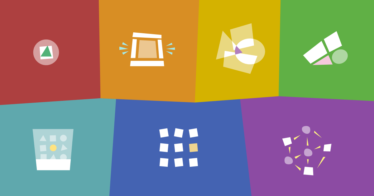
First draft of the new milestone for Bitcoin Icons. What do you think of these? As always with icons, some are more intuitive than others. Also just realizing I need to add one for faucet.
Regarding graduated wallets, the multiple wallets reference design in the Bitcoin Design Guide goes in that direction. Multiple different setups in the same application for different use cases and appropriate levels of security.
Where the activity seems currently in the ecosystem seems to be around whether Ecash, Ark, Spark, etc have a place at the very low-end for really small amounts.
I'm preparing a new release for the Bitcoin Icons (https://bitcoinicons.com). We've got some requests for mining pool, bitaxe, faucet, fingerprint, and derivation path. What are some other ones that should be added?
Are any bitcoin wallets currently implementing the "Graduated wallet" concept? Basically moving your bitcoin to more secure (and typically higher fee) layers as your funds increase.
We also called this "progressive security" in the Bitcoin Design Guide (
I like asking AI to summarize and evaluate podcast transcripts (when I don't have time, or for a second perspective on certain topics). Claude is really good at this. Now for the first time I did this for a podcast that I was a guest at. Feels weird, but it is very helpful. Sounds like I am doing OK overall, but should give more specific examples and discuss design trade-offs and learnings more. Do you do this?
I was told that UX is one of the biggest problems in Nostr these days. What are people seeing that needs improvement?
If this is the case, it would not surprise me. Early on in an ecosystem, it's about maturing the tech and infrastructure to a decent point. Then it commoditizes a bit, and the user experience gaps become more prevalent.
~50% of mobile users have at least one accessibility setting turned on, according to this Dutch research. Dark mode, bold text, zoom, increased contrast seem to be most used. Good to make sure our apps support these.
Just peeked into Nosta.me stats. Looks great. Anyone know why that big change might stem from? Seems a bit suspicious. How's traffic for other clients? The dashboard is public here:
 (Just having fun, these will not go into the icon set)


 What does simple mean to you?