> What if the typical characteristics of your industry are exactly what’s standing in the way of your new positioning?
That’s exactly where the rebranding of my latest project began.
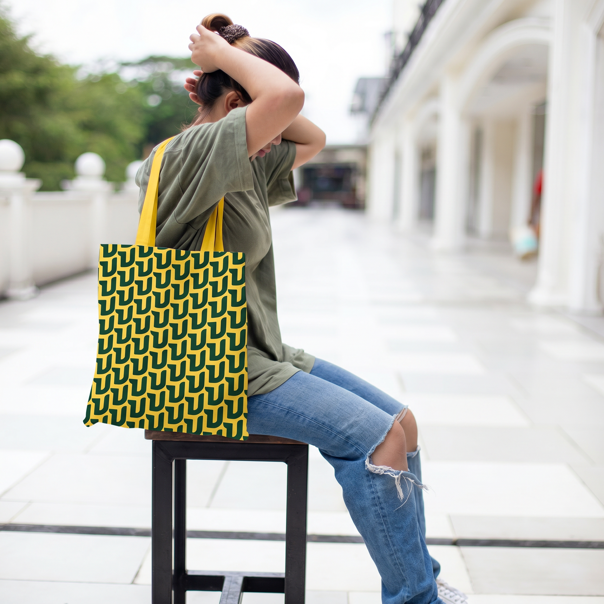
No leaves, no animals, and no typical clichés.
Switzerland brings together three language regions, different cultures and habits, yet there is one common denominator: the conviction to consistently reduce animal suffering and give people the opportunity to make a difference themselves.
With new people taking responsibility for the brand, 2026 brought new values, goals and a new positioning.
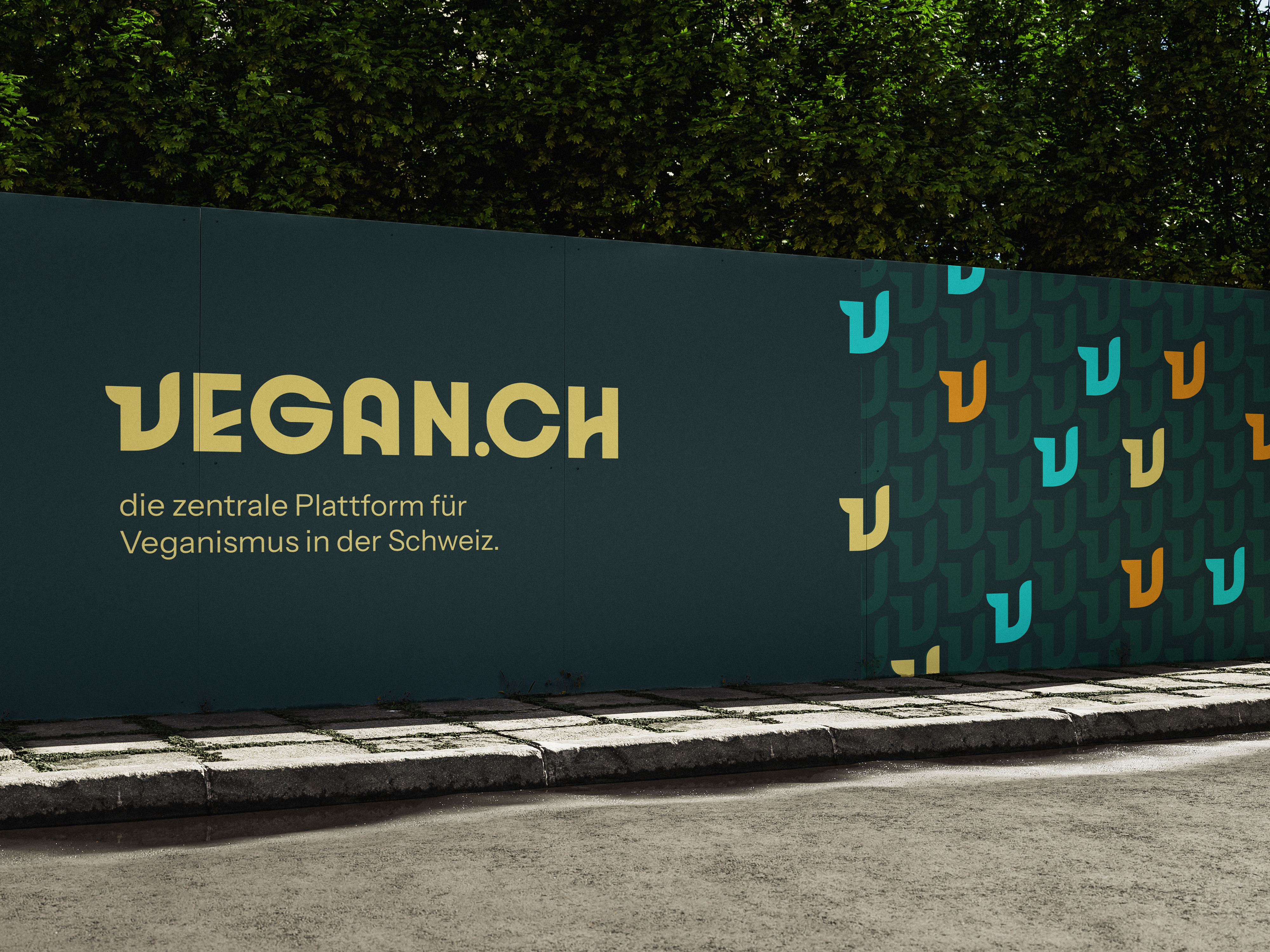
vegan.ch is becoming the central point of reference for veganism in Switzerland, connecting information, organisations, resources and people.
From a design perspective, one thing quickly became clear: no leaves, animals or hearts, no typical food aesthetic, and no conventional vegan imagery.
Because if the brand is meant to take on a new role, it shouldn’t look like much of what already exists.
Brand Mark
The V stands for entry, movement and progress and becomes the connecting element throughout the entire brand identity.
Typography and Grid
Swiss typography, grids, white space and a clear information hierarchy create structure and orientation.
Colours
The colours represent orientation, connection, activation and accessibility.
The result is a brand identity that doesn’t explain veganism through familiar symbols, but instead makes the role of vegan.ch visible:
Giving people orientation, connecting them and creating opportunities for them to take action themselves.
Thank you to Lydia Kolb, Thomas Kayser and Melanie Muggli for the collaboration and the trust in translating the new direction of vegan.ch together into a distinctive brand identity.
#vegan
#branding
#switzerland