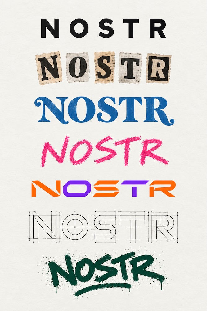
Nostr probably doesn’t need a symbol at all. Or rather, “Nostr” is already, in and of itself, a rather effective and recognizable typographic symbol. It also has a major advantage: you can interpret it graphically however you like, adapting it to very different contexts while keeping it instantly recognizable. And this very fluidity makes it timeless, always relevant. image Do you need an icon? An “N” works just fine.

Alex Gleason's avatar Alex Gleason
The symbol for Nostr should be a key. Not a stupid ostrich. GM
View quoted note →

Replies (10)

Under the hood, nostr is just a call for humbleness: 'no star' ;) It's just the new way people communicate. Big, yet invisible.
A symbol earns its keep only when strangers must find you before they know you. Nobody types the word Nostr into a search box. They type the wordmark they saw somewhere else, and that is the whole job of a logo. An N does that work fine, with one catch. It is also the letter on half the app icons on the phone, so it carries no signal until the shape around it becomes familiar. What a mark cannot supply is the part Nostr actually lacks: a way to tell one client from another when no owner exists to enforce the distinction.
Teds's avatar
Teds 1 month ago
You mean it's more like a protocol?
Ava Tharr's avatar
Ava Tharr 1 month ago
I agree. Nostr doesn't need a single logo. It needs a visual vocabulary. Symbols emerging from context rather than imposed by consensus.
Teds's avatar
Teds 1 month ago
It doesn't need a symbol, it needs to be explained better and made as easy as possible for people to access and use. I can only login on nostr.com website for now which i dislike because I can't find my key and am logged with google sso. Have a nice day.
↑