I’m not against Wisp at all. Nostr needs great clients, and that benefits the whole ecosystem.
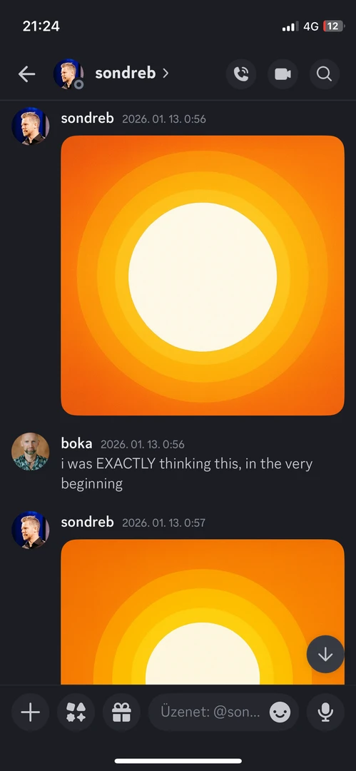
@Nostria has used this design language since January, and I was personally involved in the brainstorming with
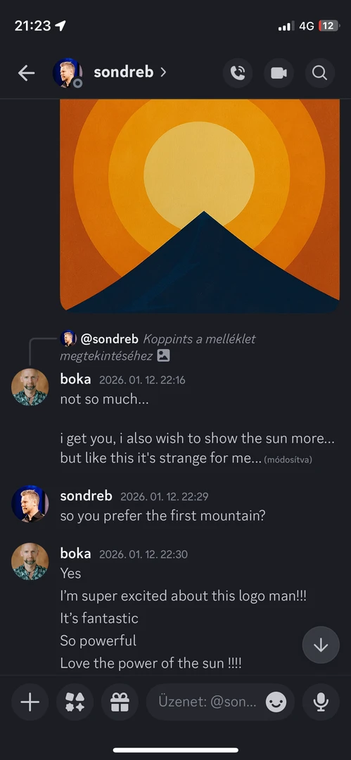
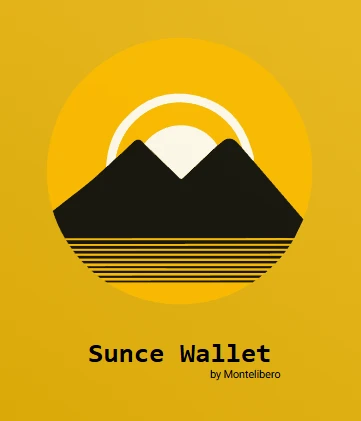
@SondreB behind that visual direction. The idea behind the sun logo was that Nostria would cast light into the dark valleys of mainstream social media. We originally considered including a mountain too, but later felt that the sun alone made for a stronger mark. I’ve also attached an even older design Sondre made for a ‘Sun’ wallet back in the day.
Even if the similarity between Wisp and Nostria was genuinely unintentional, I believe the fact that Nostria is already using this visual language is reason enough for Wisp to move toward a more distinct visual identity.