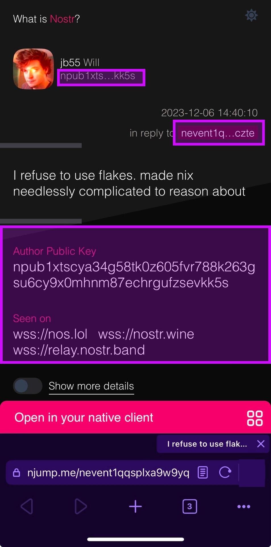
How might we improve njump mobile view for folk who have no idea what nostr is? Is njump specifically for folk who know what nostr is?
~1/4 - 1/3 in purple highlight boxes is gibberish to normies
Normie friendly note and profile info take ~1/4 - 1/3 space
What is nostr appears as a footnote. Should this be explained?
Open in your native client is clearly the main CTA. Many options follow - how does someone new to nostr know which option(s) to tap?
Show more details is there to scare normies even further with more normie gibberish😅
cc @Karnage
@elidy
@daniele
@fiatjaf